Known mostly for its solid roster of sitcom reruns and old-ish comedy movies TBS has grown into a cable television force to contend with: It's home to Conan, it has attracted original programming from powerhouse entertainer Tyler Perry, and, well, you will find Groundhog Day showing just at the right time when your brain needs some Bill Murray. Since 2004 TBS has been using its 'smile' logo and this month it has introduced a complete new on-air look, designed by Los Angeles-based Ferroconcrete, that revitalizes the channel, bringing the smile literally to life.
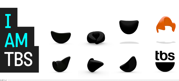
The logo (whose internal nickname unfortunately has to remain internal) has mega-personality... and you know how we feel about personality. He's mischievous, handsome — some say studly, even — and just plain fun. He's also a bit of a showoff as he interacts with onscreen characters and vies for the spotlight. His arsenal of expressions and gestures — he waves, jumps, and bows as he charms, goofs, and mimics — makes him one of history's most versatile logos; but of course his main objective is to make YOU smile.
— Ferroconcrete Case Study
TBS 2011 Network Rebrand from ferroconcrete on Vimeo.
![]()
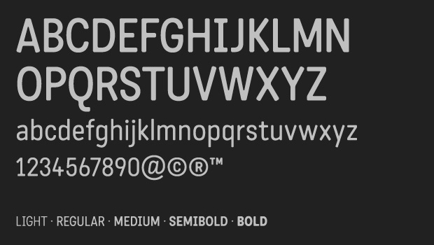
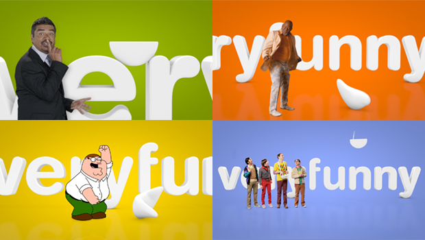
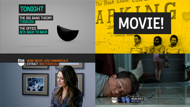
The new look maintains the logo intact but has taken the smile and transformed it into a malleable character with a pretty broad range of emotions, acting abilities, and just slightly less elasticity than Flubber — how it morphs into Conan's hair is actually quite brilliant. The "very funny" tagline also remains, except that now it's all together as in "veryfunny", not sure why, but okay. The main baby blue color has been complemented with a broader range of vibrant colors. And a new typeface, Katarine, that looks like a friendly OCR-A has been integrated into the whole package. The result, despite sounding kind of strange when described, is pretty great. It would be easy for the smile character to make TBS look like a kids' channel but it has enough irony and sarcasm to make it appealing to adults. The typography also gives it a certain edge and a contemporary look. Overall, this is a great way to give new energy to the channel without rebuilding from the ground up.
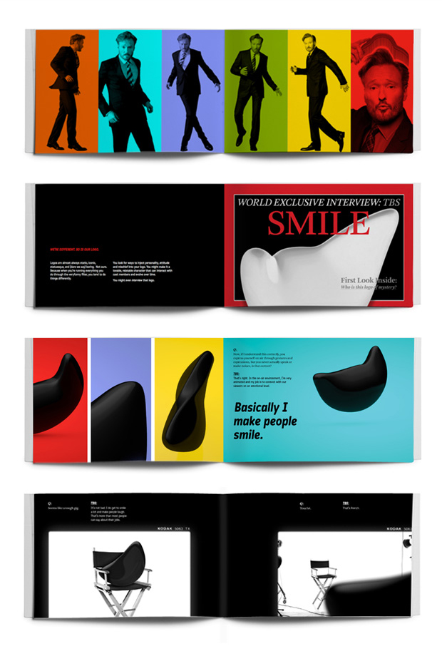
Brand book.

Don't forget to cast your vote about this post online


.jpg)