Designed by Imaginista Branding | Country: Canada
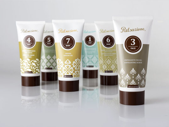
Pulsazione is a European company operating in the beauty sector that believes in offering services and products at a price that is accessible to everyone. Their new line of lotions and creams are currently being sold in Pulsazione stores globally.
One of the brand’s core values is that their products and services are priced in a completely honest way, with no hidden costs. It was very important to carry this approach through to the packaging by keeping it simple, and labelling the tubes containing the product in clear, straightforward language.
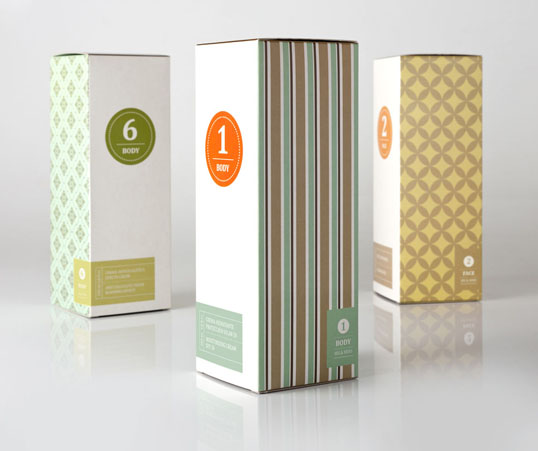
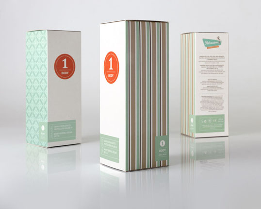
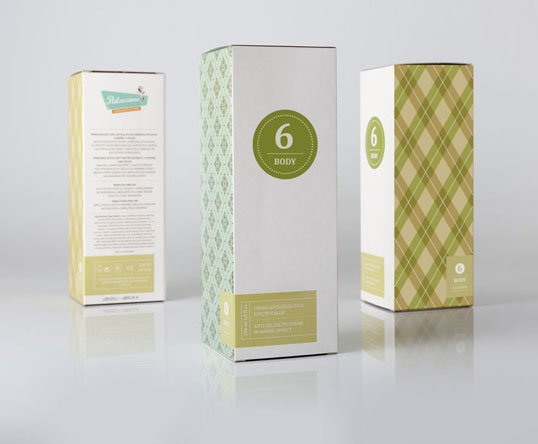
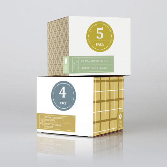
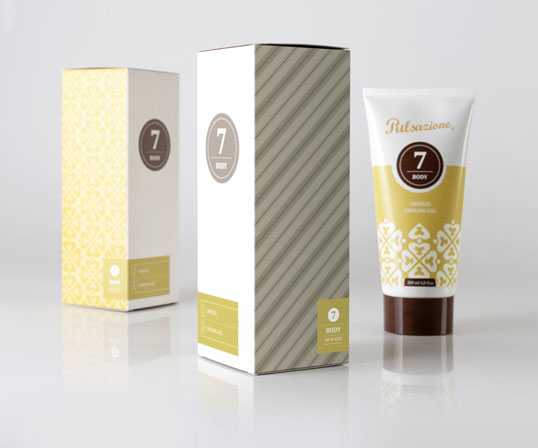
There are seven families of product within the Pulsazione Cosmetics line. One of the main objectives of this project was finding a way to differentiate these families, while keeping the packaging visually unified. This was achieved through a numbering system, with each number representing a family of products.
The packaging had to reflect that the products and services Pulsazione offer are geared towards both a male and female market. Softer, curvilinear patterns were used on one side of the box to represent female consumers, and a harsher, geometric pattern on the other side to appeal to Pulsazione’s male audience.
The white fronts of the packaging coupled with the beautiful, vibrant colours used on the sides of the boxes ensure they stand out on the shelves in the colourful Pulsazione stores.

"


.jpg)