![]()
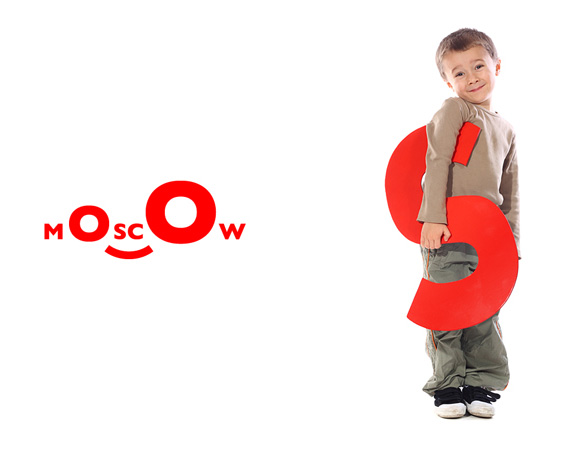
This introduction might be a little choppy because my Russian goes as far as Google Translate will take me. As a personal initiative architect Nicholas Pereslegina and designer Alexander Pershikova have launched their very own brand for the city of Moscow without any government involvement (or maybe even approval). And this is not just some proposal on a Behance page, this is a full-on brand with merchandise and souvenirs already hitting the streets of Moscow. The concept of the new logo is Surprise + Smile = Wow.
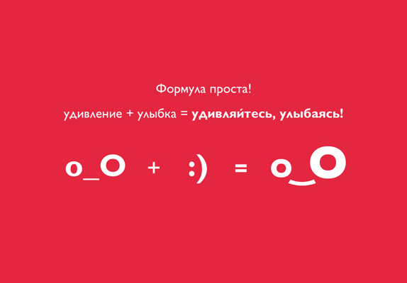
Logo equation o_O + : )

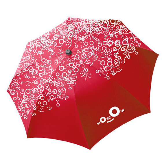
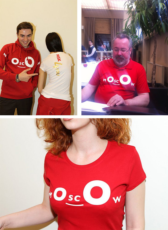
Merch in the wild.
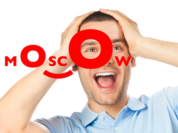
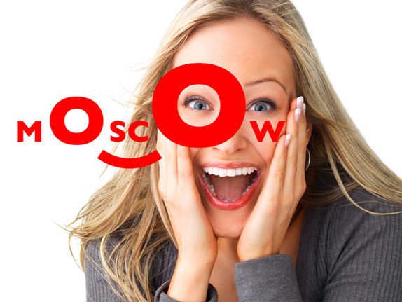
This is such a funny brand exercise because it is so unexpected, giving Moscow a very un-serious personality and one that is perfect for the TXT'ing times too. I don't think it's the most appropriate — it's perhaps too silly and youth-oriented — but it's a great way to change perceptions and expectations. The execution is pretty good, with the big "O"s just big enough to be dramatic but not that big that they are clunky. I would have certainly preferred anything other than Gill Sans for the typography but it will do. The apparel can be a little unfortunate when the "O"s land around the person's nipples, bringing unwanted attention to those assets, but perhaps even that is by design. Moscow, you got me: Wow.
A few more images and links can be found on the brand's Facebook page.
Thanks to Kristopher Reif for the tip.

Don't forget to cast your vote about this post online


.jpg)